Stamp Identification Guide for Beginners
A friendly, no‑nonsense walkthrough for spotting what you’ve got and what it might really be.
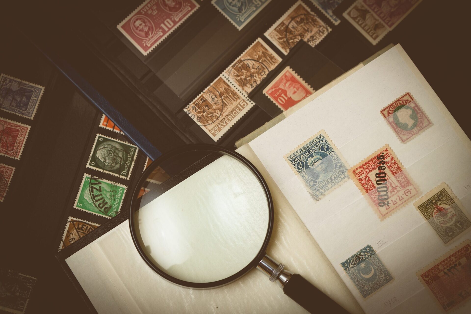
Before we start
If you’ve ever stared at a tiny queen’s head or an eagle and thought, “Right… but which one is it?”, this guide is for you. We’ll go from the big, obvious clues (country and value) into the nerdy but fun bits (perfs, watermarks, and printing methods). Same detective work the pros do, just explained in plain English.
Two golden rules:
- Work from macro to micro: country → type → measurements.
- Write things down as you go. A quick note like “GB • 1½d • red • looks intaglio • perf ~14” will save you loads of back tracking later.
Recommended beginner priorities
- Invest in good tools:
Stamp tongs, a basic perf gauge and a loupe are inexpensive but invaluable. - Keep stamps clean and dry:
Avoid humidity, direct sunlight and pressure. Use stock books or mounts instead of hinging until you’re confident. - Label as you go:
When you identify a stamp, write down its catalogue number, perforation and watermark details on a small slip or in a spreadsheet. It saves endless time later. - Join a community:
Stamp clubs, online groups and local societies are brilliant for learning and swapping duplicates. - Have fun with it:
The best collections grow from curiosity, not value chasing. Every tiny paper detail connects to a slice of history.
Your stamp collecting toolkit (and why it matters)
You don’t need a lab, but a few simple tools turn guesswork into confident IDs and they protect your stamps while you’re learning. Here’s the kit I recommend and what each bit actually does for you.
Stamp tongs (tweezers)
What they do: Let you handle stamps without skin oils, bent corners, or “whoops, I just nicked a perf.”
Why it matters: Condition is king. If a stamp still has its original, untouched gum (you’ll see MNH — Mint Never Hinged), it’s almost always worth more than the same stamp with disturbed gum. Tongs are the cheapest insurance you’ll ever buy.
What to buy: Light metal, flat or spade tips. Start inexpensive; upgrade if you love them.
Magnifying loupe (8×–10×)
What it does: Reveals the tiny tells like raised ink lines from engraving, fuzzy edges from litho, plate flaws, and the fine detail in cancellations.
Why it matters: Printing method is a massive clue when two stamps look practically identical. Under a loupe, they don’t.
What to buy: Any clear 8×–10× works. If you wear glasses, a wider eyepiece is kinder.
Perforation gauge
What it does: Measures how many perforation teeth or holes per 2 cm. You’ll see this written as “Perf 11” or “12 × 10” for compound perfs (horizontal first, then vertical).
Why it matters: A half step in gauge can be the difference between bog standard and scarce. It’s often the decider between two catalog numbers with the same design and colour.
What to buy: A clear plastic gauge is perfect to start. If you’re fussy (in a good way), continuous scale gauges make lining up a breeze.
Watermark detector (tray + fluid or electronic)
What it does: Shows the faint design pressed into the paper (crowns, letters, lines), plus the orientation (upright, inverted, sideways).
Why it matters: Watermarks split look alikes into different listings, sometimes with very different values. They also help spot paper thins and other faults.
What to buy: A small black tray and proper non aqueous watermark fluid is beginner friendly. Skip lighter fluid and anything nasty or smelly. Electronic units are brilliant if you’re dealing with pricier material.
Stamp catalogues
What they do: Give every stamp an official identity number and list the variations (perfs, watermark, shades, paper) so you can pin yours down accurately.
Why it matters: The catalogue number is the language buyers, sellers and collectors use. Without it, you’re guessing.
What to use: Scott is common worldwide; Stanley Gibbons is a favourite in the UK. Read the intro pages, the symbols and abbreviations unlock everything.
Colour key
What it does: Lets you compare your stamp to standard colour chips so “rose” vs “carmine” isn’t just vibes.
Why it matters: Shade can point to different printings, but beware changelings (faded by sun or chemistry). Use colour to narrow, then confirm with perf and watermark.
What to buy: A simple, fan style colour key. Check colours in good, neutral light.
Quick reference: tools and what they solve
| Tool | Helps you identify | Hidden win |
|---|---|---|
| Tongs | Condition (MNH/MH), intact perfs | Stops accidental damage while learning |
| Loupe 8×–10× | Printing method, plate flaws, cancel detail | Confirms ‘is it engraved?’ in seconds |
| Perf gauge | Exact issue/variety, compound perfs | Separates common vs. scarce look alikes |
| Watermark setup | Paper type & orientation | Spots thins and repairs early |
| Catalogue (SG/Scott) | The right number & listing | Teaches what to measure next |
| Colour key | Shade varieties | Flags possible colour changelings |
How we’ll use the kit
In the next section, we’ll start with the big clues on the stamp (country, currency, design type), then bring in the tools in a sensible order so you only measure what you actually need. No faff, just a clean path to the correct catalogue number.
1: The big clues – country, currency and design type
Before you start measuring anything, let’s get the obvious stuff nailed down. These are the “macro” clues that give you the country, rough time period, and what kind of stamp it might be.
Country of origin
Nearly every stamp has its country printed somewhere on it. The one exception is Great Britain, which traditionally uses the monarch’s portrait instead of a name. If your stamp just has a queen or king’s head with no country, that’s your clue it’s British.
The tricky bit is when the country name isn’t in English or doesn’t exist anymore. You might see DEUTSCHES REICH (Germany), BOHMEN UND MAHREN (Czechoslovakia – Bohemia and Moravia), or HELIGOLAND. It’s part of the fun, really – stamp collecting is a crash course in history and languages all at once.
If you’re stuck, use an online country identifier or flip through the back of your catalogue. Both the Scott and Stanley Gibbons books list older or foreign spellings, so you can match what you see.
Currency and denomination
If the country name is missing or tricky to read, look at the currency. Words like Pfennig, Peseta, Kopek, or Dinar can narrow things fast. Each country section in a catalogue lists its historical currencies, so even if you’re dealing with an older issue, you can match it.
The denomination (the number on the stamp) also helps sort things. Lower values usually belong to definitive sets – the everyday workhorses – while higher ones might be airmail, commemoratives, or special delivery issues. If there’s a printed year, that’s gold; it tells you the earliest possible issue date.
Design type
Once you’ve got the country and value, look at what the stamp shows. Monarchs, presidents, coats of arms and landmarks are typically definitive stamps (the standard ongoing series). Big, colourful designs that celebrate an event or person are usually commemoratives. A plane or the word “AIRMAIL” points to, well, airmail.
Jot those first impressions down – they’ll make your catalogue search much faster. In the next step, we’ll dive into how to match what you’ve spotted to the right entry and catalogue number.
Finding it in the catalogue
Here’s where the detective work really kicks in. Your goal is to give the stamp its official “catalogue identity,” that all-important number that collectors use when listing or trading.
How to navigate a catalogue
Catalogues like Scott and Stanley Gibbons are arranged by country, then by type (definitives, commemoratives, airmails, dues, etc.), and finally by date. Flip to your country and look for an image that matches your stamp’s design. Check the value, colour, and rough issue period to narrow it down.
Once you’ve found the match, note the number. That’s your stamp’s unique ID. For example, “Scott 123” or “SG 456.” That number is now your reference point for everything that follows.
Why the number matters
That little catalogue code unlocks the rest of the information. Under it you’ll find variations like different perforations, watermark types, or paper styles. Two stamps that look exactly alike might have completely different catalogue numbers because of a half step difference in perforation gauge or a flipped watermark. That’s why we always go from visual match first, then confirm with measurements.
The catalogue as a fairness check
Catalogues also tell you what a stamp should be worth in top condition. Treat those prices as guidelines, not gospel, because real value depends on how clean, centred, and well-preserved your example is, plus what people are actually paying on the market. But the catalogue keeps everyone speaking the same language and helps you avoid wild guesses.
Quick tip: learn the symbols
Each catalogue has its own shorthand for things like colour changes, reprints, or overprints. Spend a few minutes with the key or introduction pages. It makes life easier when you see things like “Perf 14 × 13½” or “Wmk Crown CA inverted.”
Getting technical – perforations and paper
Now that you’ve found your stamp in the catalogue, it’s time to confirm it’s the right one. This is where your tools come into play, especially your trusty perforation gauge and watermark setup.
Measuring perforations
Those tiny holes around the edge of your stamp are more than decoration; they’re key to identifying the exact issue.
How to measure:
Line your stamp up on the perforation gauge until the printed dots on the gauge line up perfectly with the perforation holes on your stamp. The goal is for the teeth and the gauge marks to match across the entire side. If they don’t quite line up, keep sliding until they do. The number shown (like “Perf 11”) tells you how many holes fit into two centimetres.
Tip: Stamps can have different perforations on each side, known as compound perforations. Always measure both directions, horizontal first, then vertical, and record it as something like “Perf 12 × 10.”
Even a half step difference in measurement can separate a common stamp from a rare variety. It’s that precise.
Why it matters:
Sometimes two stamps look identical in colour, design and value but differ only in perforation. Your gauge will tell you whether you’ve got the regular issue or something worth a closer look.
Checking the paper and watermark
A watermark is a faint pattern pressed into the paper during manufacturing, like crowns, letters or wavy lines. It’s an old school anti forgery trick that’s still one of the most useful clues for collectors.
How to check:
- Place the stamp face down in a small black tray.
- Add a few drops of watermark fluid (make sure it’s non aqueous so it won’t harm the gum).
- Watch the design appear for a few seconds before it fades again.
You can also use electronic detectors, which shine light through the paper without using any fluid. They’re handy for valuable or delicate stamps.
What to look for:
- Type: The design itself, such as “Crown and Script CA.”
- Orientation: Is it upright, sideways, or inverted?
- Presence or absence: Some printings used paper without a watermark at all.
Sometimes a watermark is unusually clear even without fluid. That can be a red flag for damage, since if the paper’s been thinned or the gum has degraded, the watermark will stand out more sharply than it should.
Quick checklist before moving on
- Measure both sides with your perf gauge.
- Record your watermark type and direction.
- Check for paper flaws like thins or tears.
- Compare everything with your catalogue listing.
Once those details line up, you’ll know you’ve pinned down the right issue. Next, we’ll move on to printing methods, ink and colour, where your loupe becomes your new best friend.
Printing methods, ink and colour
When two stamps look almost identical, the difference often lies in how they were printed. Your magnifying loupe is the key here. With a bit of practice, you’ll start spotting patterns that reveal exactly which printing process was used.
The main printing types
There are a few main printing methods used for postage stamps. Each one leaves tiny clues you can spot under magnification.
Intaglio (also called line engraving):
Ink is pressed into engraved grooves on a metal plate, then transferred under high pressure onto the paper. The result feels slightly raised, almost three dimensional, and the lines are crisp and sharp. You can often feel the ink ridges if you gently run your finger over them. Classic stamps like the Penny Black were printed this way.
Letterpress (relief printing):
The opposite of intaglio, this uses raised areas on the plate to apply ink. The impression may leave a shallow dent on the back of the paper. Look for strong outlines and slight ink “squeeze” at the edges of the design.
Lithography (planographic printing):
A completely flat method that relies on the principle that oil and water repel each other. The image sits on the surface of the paper and doesn’t leave any raised texture. Under the loupe, edges may look a little fuzzy rather than crisp.
Photogravure:
A variant of intaglio that uses tiny dots instead of solid lines to create shading. Under magnification, the image looks like a screen of even, circular dots. Modern definitives and large runs often use this process.
Why printing method matters
Knowing the printing process narrows down the issue period and confirms which version of a design you have. For example, a British Machin printed in photogravure is a completely different catalogue listing to the same design printed in intaglio.
Printing type can also help spot forgeries. Counterfeiters often miss the texture and depth of genuine engraved stamps.
Colour and shade checks
Colour might seem obvious, but tiny variations can mean completely different listings. The difference between rose and carmine red could mark separate printings or years.
How to check:
Use your colour key in good daylight or under a daylight bulb. Compare directly, not from memory. Note the closest match, then confirm it with your catalogue.
Watch for colour changelings:
Sometimes colours fade or alter because of sunlight, moisture, or chemical reactions.
- Reds tend to fade to pink.
- Blues and greens can darken or dull through oxidation.
- Sulphur exposure can shift certain inks to brown.
If you suspect fading or chemical change, treat the colour as unreliable and rely instead on your perf and watermark data for the true ID.
Quick recap
- Use your loupe to check whether ink is raised, flat or dotted.
- Match what you see to one of the main printing methods.
- Compare the colour carefully against your key.
- Be wary of stamps that look too pale or too brown; they may have changed over time.
Up next, we’ll get into postmarks and condition, which is where you’ll learn how to grade and value what you’ve found so far.
Postmarks and condition
Once you’ve pinned down what your stamp is, the next question is how good it is.
Condition is one of the biggest factors in value, and for used stamps, the postmark adds a story too.
Postmarks and cancellations
Every used stamp carries a trace of its journey, shown in the black or coloured marks that stopped it from being reused.
There are two parts to a typical cancellation:
- The cancel or killer: The section that defaces the stamp so it cannot be reused.
- The postmark or dial: The circular part showing the place and date.
That date can be surprisingly useful. It helps confirm whether the stamp was genuinely used during its correct issue period. A postmark that predates or follows the known dates of use might mean you have something unusual, or at least something worth double checking.
Common postmark types:
- Bull’s Eye or Socked on the Nose: Perfectly centred on the design, showing the full date and location. Collectors love these.
- Barred Numeral: Common on early British Empire stamps, where each number matched a specific post office.
- Fancy or Pictorial Cancels: Often shaped or themed, carved from cork or rubber, and used for events or holidays.
- Transit Marks: Added while the mail was travelling, often by train or ship.
Clean, readable cancellations add character and value. Heavy or smeared ones can lower appeal, especially if they obscure the design.
Grading condition
Collectors use a few standard terms when describing a stamp’s condition. For unused stamps, the state of the gum is critical. For used stamps, centring and perforations matter most.
Mint Never Hinged (MNH):
Perfect gum, untouched. The highest grade for unused stamps.
Mint Hinged (MH) or Unused:
Has hinge marks or light gum disturbance. Still collectible but less valuable.
Unused without gum:
No gum left at all, usually worth less unless it is an old issue where gum removal was recommended.
Used:
Cancelled and postmarked, but value depends on clarity and placement of the mark.
Average (AVG):
Design may be off centre, perforations cut into the image, or visible creases or thins.
Why gum matters
The gum on the back is more than just glue; it is part of the stamp’s original state. Some early issues used acidic or unstable gum that could damage the paper over time, especially in humid climates. If you collect in a warm or damp area, keep stamps dry and store them in mounts or stock books rather than on pages with hinges.
Watch out for tropicalisation, where gum cracks or turns brown. It looks ugly and can eat into the paper fibres. Once it starts, there is no fixing it.
Quick tips for grading
- Check centring first. Well centred designs are prized.
- Look for pulled or missing perforations.
- Hold the stamp under a light to spot thins or creases.
- For mint stamps, inspect the gum carefully.
- For used stamps, note if the postmark is neat and complete.
Once you have checked those boxes, you will have a good idea of both your stamp’s identity and quality.
Varieties, overprints and printing errors
Once you are comfortable spotting the basics, it is time to look for the really interesting stuff. Some stamps have extra markings, some were altered on purpose, and others left the printing press with mistakes that can make collectors’ hearts race.
Overprints and surcharges
An overprint is any extra wording or design added to a stamp after it was printed. Postal authorities use them for all sorts of reasons: to change a stamp’s purpose, to mark a new country name after independence, or to celebrate a special event.
A surcharge is a specific type of overprint that changes the value. When postal rates changed suddenly or there were shortages, it was easier to overprint new values on existing stamps than to print fresh ones.
Because overprints and surcharges were quick fixes, they are often faked. Always check:
- Identify the base stamp first. Work out what the design originally was before the extra text was added.
- Check the size and spacing of the overprint. Genuine ones were applied consistently, while forgeries often vary in alignment or letter shape.
- Look at the ink. Real overprints usually sit clearly on top of the original design and sometimes leave a light impression you can feel.
If anything looks uneven, smudged, or too perfect, compare it with a known genuine example online or in a catalogue. Overprint forgeries are some of the most common tricks in the hobby.
Errors, freaks and oddities (EFOs)
These are the happy accidents of the stamp world. Errors are major mistakes that slipped through the printing process. Freaks are one-off printing faults. Oddities are minor quirks that happened during production.
Here are some to keep an eye out for:
- Missing colour: One ink layer did not print. The design may look unfinished or pale.
- Colour error: The entire stamp was printed in the wrong colour.
- Design or text error: Misprints, spelling mistakes or incorrect dates.
- Imperforate: Stamps without any perforations where there should be some.
- Imperforate between: The gap between two stamps in a pair is missing its perforations.
- Perforation shift: The perforations cut into the design or sit way off centre.
- Double print or over-inking: Two impressions slightly offset, giving a blurry or shadowed look.
Most of these were caught quickly, but some escaped into circulation. When they did, they became some of the most famous and valuable items in philately.
Using modern tech to help
Today there are apps and online databases that use image recognition to match stamp designs to catalogue numbers. They can be a great starting point for narrowing down possibilities, especially for large worldwide collections.
Just remember that they can only get you so far. Real identification still relies on your measurements, your loupe, and your knowledge of watermarks and perforations. The apps are like a shortcut to the right page, but you are still the detective who confirms the truth.
Quick recap
- Overprints are deliberate; errors are accidental.
- Always identify the original design before judging a stamp’s rarity.
- Check for overprint alignment, spacing and ink texture to rule out fakes.
- Keep an eye out for printing or perforation errors; they can be worth investigating.
- Use digital tools to assist, not replace, hands-on checking.
Bringing it all together
By now, you’ve gone from simply recognising a stamp’s design to properly identifying it, confirming the fine details and understanding its condition. That’s a massive step up from where most beginners start.
Stamp identification might sound technical at first, but really it is about slowing down, observing and using the right tools in the right order. Once you get into the rhythm, it becomes second nature.
The key takeaways
- Start big, then go small. Always begin with the obvious clues: country, currency, and design.
- Let the catalogue guide you. It is your index, your checklist and your translation tool all in one.
- Measure carefully. Perforations and watermarks often separate look-alikes that differ hugely in value.
- Use your loupe. Printing type and ink texture are small details that can confirm authenticity.
- Judge condition honestly. A common stamp in top shape can be more desirable than a rare one with faults.
- Stay curious. Every oddity teaches you something new about how stamps were made and used.
Works cited
How to Identify Stamps? – American Philatelic Society
A Quick Guide to Perforation Gauges and How to Use Them in Stamp Collecting
How to Identify Colors on Postage Stamps – Mystic Stamp
Tools Needed to Get Started? – American Philatelic Society
How to Start Stamp Collecting for Beginners – Stanley Gibbons
Postage Stamp Gum – Wikipedia
Philatelic Equipment for a Beginner – Reddit
Stamp Perforation Gauges – iHobb
Slotted Aluminum Perf Gauge – iHobb
SAFE PERFOtronic – NOLA Stamp Shop
Detecting Watermarks – Brixton Chrome
Watermark Detection Tools and Fluids – iHobb
Check Watermarks to Make Sure You’ve Got the Right Stamp – Linn’s Stamp News
Scott Stamp
Philatelic Terms for Beginners – Stanley Gibbons
Stamp Catalogue Advice – Reddit
Postage Stamp Colour – Wikipedia
Stanley Gibbons Postage Stamp Identifier Philatelic Color Key Guide
Perforation Gauges – SAFE Collecting Supplies
Foreign Stamp Identifier – Mystic Stamp Discovery Center
Stamps Without a Country Name – Linn’s Stamp News
Stamp Identification Guidelines – Mystic Stamp Discovery Center
How to Read an SG Catalogue – Stanley Gibbons
Understanding the Scott Catalogue Listings – Amos Advantage
StampManage: Stamp Collecting Software with SCOTT Numbers
Colour Changelings or Genuine Varieties? – Linn’s Stamp News
A Comprehensive Guide to Grading Stamps – Warwick & Warwick
How to Measure Perforations – Mystic Stamp Discovery Center
How to Find Watermarks on Stamps – YouTube
Finding Watermarks on Stamps – Hobbizine
Postage Stamp Gum: A Sticky Subject – Linn’s Stamp News
Determining Printing Methods Can Confuse Anyone – Linn’s Stamp News
Basic Printing Methods and How to Tell Them Apart – American Philatelic Society
Stamp Errors Explained – Warwick & Warwick
Errors, Freaks, and Oddities – Wikipedia